
Postcard Design Ideas: How to Choose the Right Card Front for Your Campaign
Compare Handwrite postcard designs and learn which card front works best for thank-you notes, seasonal campaigns, premium business mail, and client outreach.
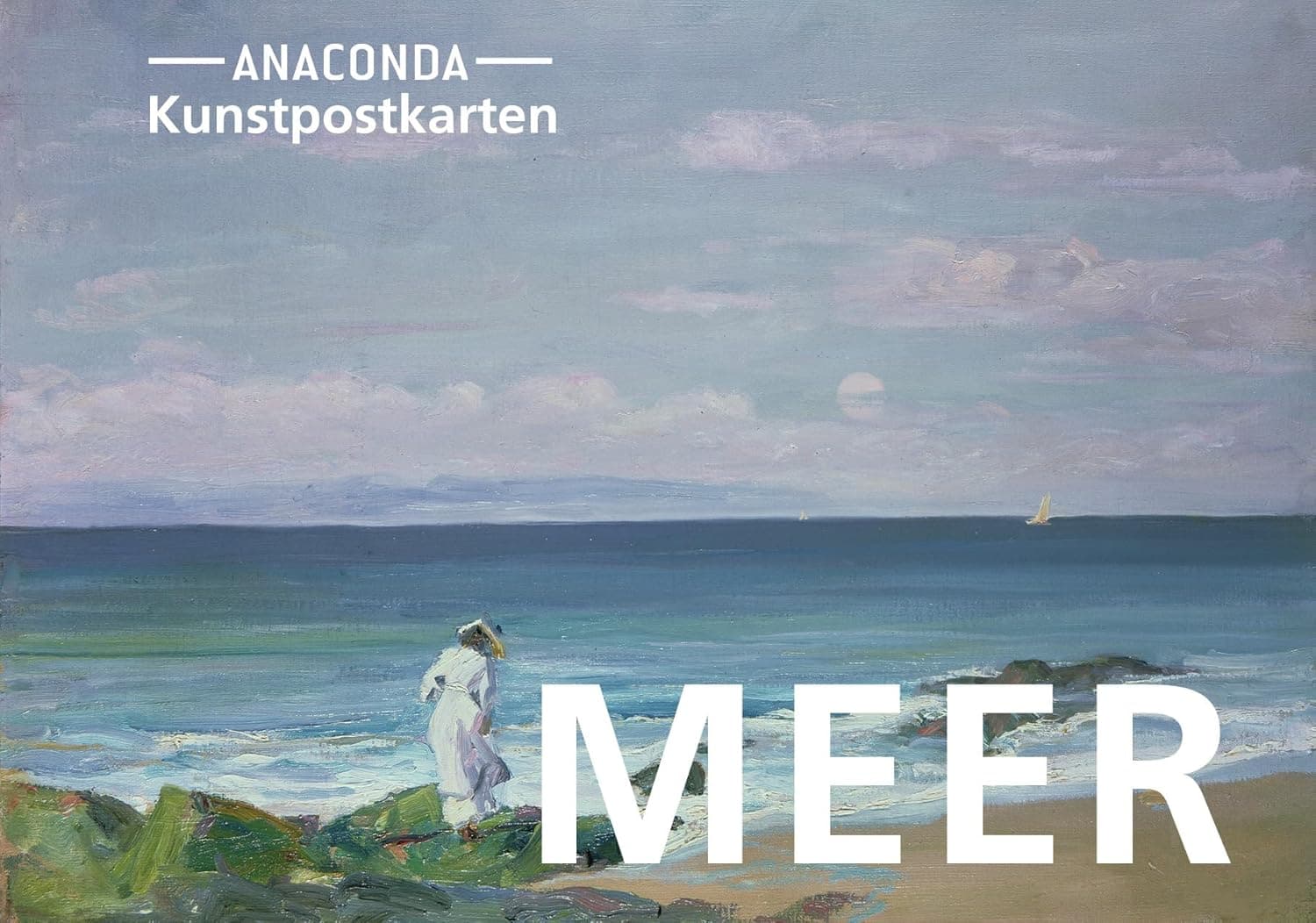
The front of the postcard creates the first impression before the recipient even turns it over. Handwrite currently offers a tight, curated collection rather than an overwhelming catalog, which makes it easier to choose a design that feels intentional.
If you are choosing between postcard designs for client thank-you notes, seasonal campaigns, premium business mail, or founder outreach, the best option is usually the one that supports the tone of the message instead of trying to do too much on its own.
Our current fronts are based on postcards from the Anaconda Postkarten series by Anaconda Verlag, which is part of why the collection feels more like curated art stationery than generic corporate stock.
The current collection
🌊 MEER
Airy, calm, and editorial.
Best for: Thank-you notes, modern brands, summer campaigns, reflective messages
Mood: Open, quiet, premium
Why choose it: MEER has the most negative space and the lightest visual feel of the three. It works well when you want the card to feel understated rather than decorative.
🌿 GÄRTEN
Warm, lush, and generous.
Best for: Welcome notes, relationship mailings, seasonal campaigns, client appreciation
Mood: Human, colorful, memorable
Why choose it: GÄRTEN has the most warmth and movement. If you want the card to feel generous, gift-like, or emotionally rich, this is usually the strongest option.
🌳 BÄUME
Grounded, timeless, and quietly confident.
Best for: Thoughtful follow-ups, autumn mailings, heritage brands, more serious messages
Mood: Stable, classic, rooted
Why choose it: BÄUME feels more structured and a little more serious than the other two. It is a good fit when you want the postcard to feel substantial without becoming formal.
How to choose the right one
Consider these factors when selecting your design:
1. Your audience
- Personal and relationship-driven mail —
GÄRTENoften feels the warmest - Premium or restrained business communication —
MEERis usually the safest choice - More grounded or classic tone —
BÄUMEworks well for serious follow-ups
2. Your message
- Thank-you and welcome messages — warm fronts generally perform well
- Professional updates and outreach — cleaner compositions keep the message in focus
- Seasonal or thoughtful notes — choose the design whose mood matches the occasion
3. Your brand
If you are sending as a business:
- Match design colors to your brand palette when possible
- Ask whether the front feels like your company: calm, warm, or grounded
- Make sure the design supports the message rather than competing with it
Best postcard designs by use case
- Client thank-you notes —
GÄRTENorMEERusually work best, depending on how warm or restrained you want the note to feel. - Premium B2B outreach —
MEERis the safest choice when you want a clean, editorial look. - Seasonal and holiday campaigns —
GÄRTENoften feels the most generous and gift-like. - More serious follow-up or reflective messaging —
BÄUMEis usually the strongest option.
What the recipient actually sees
The artwork appears on the front of the postcard. Your handwritten message and handwritten recipient address appear on the back. That means the design sets the emotional tone before the message is read.
Preview your card
In the order flow, you can preview exactly how your postcard will look:
- Use
Flip Cardto switch between front and back - Check the interaction between the chosen design and your handwriting style
- Verify the message, address, and overall balance before checkout
Need a recommendation?
If you are unsure, use this simple default:
- Start with MEER for clean business mail
- Choose GÄRTEN for warmth and relationship-building
- Use BÄUME for a more grounded, classic tone
If you want a second opinion for a campaign, contact us and tell us who the card is for.